Design Guide
How this site was made
Designing a room you descend into.
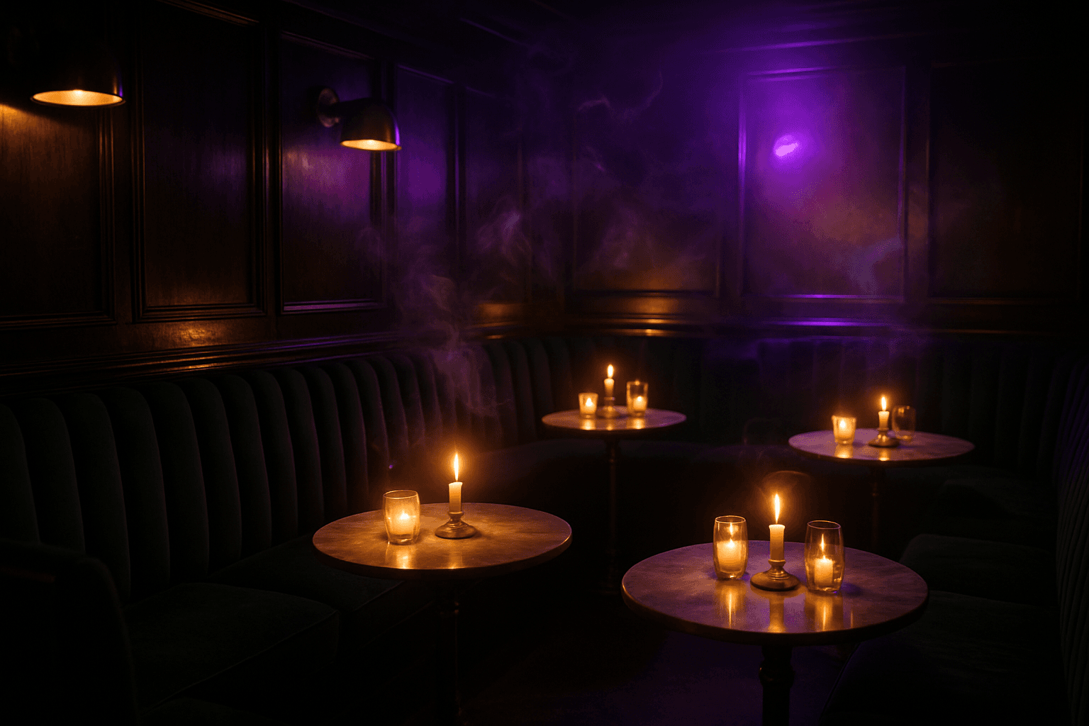
Nightjar sells atmosphere — the feeling of stepping off a loud street into candlelight. So the site behaves like the room: dark, warm, a little theatrical, never fully still. This page documents the decisions.
Palette
Candlelight against the void.
The base is a black with green in it — the color of a dark room with emerald velvet in it, not a screen turned off. Amber is candle and neon; violet is the night outside; cream is every piece of text, warmed like paper that has lived near smoke.
Void
#0B0F0D
Deep Emerald
#1E3A2F
Neon Amber
#FFB454
Electric Violet
#B76EF0
Candle Cream
#F3E3C3
Typography
A playbill and a typewriter.
DM Serif Display plays the marquee — a high-contrast theatrical serif that belongs on a playbill or a neon sign. It only appears large; it never does body-copy work.
Space Mono does everything else: menu specs, prices, hours, house rules. Typewriter energy — the voice of a menu card typed in the back office, dot leaders and all.
Display — DM Serif Display
Six drinks. Zero apologies.
Body & labels — Space Mono
rye · amaro · burnt orange · black walnut
The Machinery
Smoke, neon, and candle physics.
Hand-rolled smoke
The hero's smoke is fractal value-noise computed per-pixel on a 176×110 canvas, upscaled by the browser for a free blur. Domain-warped for curl, tinted amber-to-violet by a second noise field, drifting upward and leaning gently toward your cursor. Throttled to 30fps, paused offscreen, static under reduced motion.
Neon that misbehaves
The wordmark's glow is five stacked text-shadows with an irregular flicker keyframe — the timing of a tube with a loose transformer, not a metronome. One letter in the logo runs its own dying-flicker cycle, because every good sign has one letter going.
Candlelight cards
The menu card breathes: a radial amber gradient rises from the bottom edge while the box-shadow pulses on a slow 5.5s cycle — the visual rhythm of a candle two feet away. Art-deco corner marks and double rules frame every image like the print shop this room used to be.
Why it works
Maximalism with discipline. Smoke, neon, flicker, ornament — but only five colors, two typefaces, and one recurring frame treatment. The drama sits on a strict system, which is why it reads as theatrical instead of noisy.
Scarcity as voice. The copy never begs. Four loose tables, a capped membership, a door you have to find — the site's job is to make you want to earn it, and confident restraint sells that better than any photo carousel.
Darkness done properly. Cream text sits at readable contrast on the void; images are dimmed toward the room's own light level; grain keeps the big dark fields from banding. Dark mode as a brand, not a toggle.